Wednesday 24 February 2016

Here are the rough ideas of my final piece, with annotations.


Monday 18 January 2016

At the start of the year, we made a blogger account. Since then we’ve added loads onto it.
The first piece of work we did on the blogger was about urban environments and what they where and where they where. So, we explained what one was then we went out and took some pictures of what we thought was an urban environment OR find some pictures, which we had taken previously of what we thought was an urban environment. This then links into the next piece of work, which we did. Rule of thirds. The rule of thirds wasn’t the easiest at first for me because I didn’t really understand much about it, but once we’d learnt a lot more about it, it became I bit easier. Another thing we did was, find an image and describe the rule of thirds within the photo.

Next, we started learning about urban juxtapositions. An urban juxtaposition is something in a place, which you wouldn’t normally find it. I found a few images which I had taken and put them on my blogger.

Then, we started to learn about Typography. Not the most interesting thing I’ve learned but it all goes towards the final piece towards the end. But, apart from that I’ve learned different type fonts and what they all mean.

And finally, all this work, which we have done, leads up to the big thing. The exhibition poster for the Turnpike Gallery in Leigh. We made this poster by using ADOBE ILLUSTATOR. Creating a poster for the new gallery which is opening.

Over the year, it’s been hard because I’m new to all the Photoshop and editing stuff, but I think I’ve improved because I came here with no idea what to do, to being able to edit photos all by myself. But the only time I need or ask for assistance is when I really really cant do something.


Monday 19 October 2015

EXHIBITION POSTERS

I chose these images because they're all in urban environments and uses sans serif text, as well as serif, display and script. I chose them because I think that they all fit perfectly, for example the images fit to an urban environment but the titles do describe the image too, which works as well. Making them to right image and headline for an urban juxtaposition. For example, the photography exhibition (the last photo),works really well because the image shows what the title of the book is; walking through the doors to the exhibition. Giving you feel of how it would feel if you walked through the doors of a photography exhibition.

This poster uses good composition and also the rule of thirds.


There is a contrast between the red writing and the black writing. But also a contrast between the black and white colours on the image.


Contrast between the black and white. But also, the text font stands out because it's on a black background.


Its split into the rule of thirds because of the text and the writing at the bottom, but also the image will be split into the rule of thirds too.


Rule of thirds works here because you'll have the buildings in the bottom third, and the sky in the top thirds.
The reason why i chose these images to be in the typography, is because they're logos which should have the correct typography on them. But also, the writing further down shows the next lot of typography shows display and script. Giving up not only logos to focus on, but also how other things which aren't logos should be written and used.


SERIF
This type face is a serif type face because it would be used on a logo.


SCRIPT
Used on book covers because it is something which is formal and appealing.


SANS SERIF
usually used on logos but look more cleaner and more modern.


DISPLAY
The type face which you would normally use on a poster.

Monday 28 September 2015

Juxtapositions


This image is an urban juxtaposition because it's in a place where you wouldn't normally find architecture.  But it works as well because it's in a city and there was no sign of a boat crash for tragedy in new york (not that i would remember) so why this would be there, is random. Making it an urban juxtaposition.


This image is an urban juxtaposition because it's in an usual place. It's in an unusual place because you wouldn't normally see fire at a match. But it looks like it's not supposed to be there because it looks like its floating and not coming out of a machine. Making it look like it's not supposed be there, i would class this as an urban juxtaposition.


This image is an urban juxtaposition because you would never find a set of grapes places on an electricity box. With this image, the grapes where just placed there, they where exactly there how i found them. So it was strange to find some grapes rotting away in the sunset. A place where you wouldn't usually expect to find grapes. Mainly in a fridge.
This is in an urban juxtaposition because it's unusual to find a helmet on a laptop. You'd usually see a helmet in someones cupboard or on someones head, not on a laptop.
Here is another example of an urban juxtaposition because it's in a place where it shouldn't be. You would never find the object / subject here. So in my opinion, this here is a good example of an urban juxtaposition.

This image is an urban juxtaposition because this bench is in a random place but also there is a teddy on it and you wouldn't normally find a teddy left on a bench around college.


This here is another example of an urban juxtaposition. This is because my object/subject is placed where you wouldn't normally find it or wouldn't normally be there. This is why i chose the place where the object should go. So in this case, it's an urban juxtaposition.

Also, this image is an urban juxtaposition because the teddy is placed on a wall and you wouldn't normally find a teddy on a wall, especially at college. This is definitely an urban juxtaposition.

The image I have taken is an example of an urban juxtaposition because the object / subject is placed in a weird place because you wouldn't normally find it there. Only on toy story but in the real world you wouldn't. So, i do think it's a good example of an urban juxtaposition.

This image which I have taken is another example of an urban juxtaposition because it's in an urban place but also the object / subject is in a place where it shouldn't be. So this image repreents an urban juxtaposition.


Monday 14 September 2015

Urban Environments


This image shows the rule of thirds.  Because the image is portrait it looks like it's not going to work. But it will, you'll have the flower effect in some of the boxes but you'll also have parts of the branch and parts of the background city in the boxes. So the rule of thirds will work.

This next image will capture the rule of thirds because this picture is full of lots of different things. Meaning that in every box you will have things which can vary from buildings to tress and then to water. The reason why i chose this image as well is because (left hand side for example) if you start with the top box, then you'll get the effect of the sky. Then with the box underneath it, you'll get some of the tree and then with the bottom box, you'll get the effect of the water. And then so on with the other boxes. So, in my opinion the rule of thirds will work with this image.
The reason why i chose this image is because you will get the rule of thirds here. Although the image is filled with building, in every box it will all be completely different. This is because you'll have some small building, medium sized building and tall buildings. But apart from size, you'll get the effect of the different colours within the image. So again, the rule of thirds will work.


With this image which I have chosen, the rule of thirds will work. Even though there is a massive railing in front. This is because you won't have the railings in every box. You'll gradually lose the railing the further you go down the image. And even though it's a zoomed out image, you'll still get the effect of the rule of thirds.
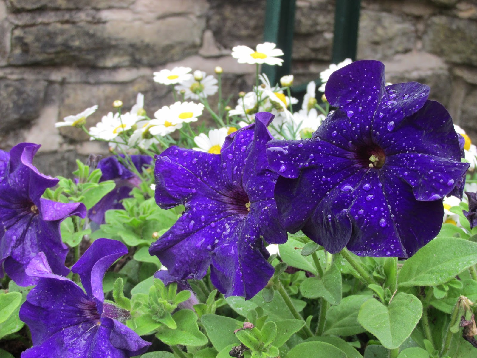
This image which has been chosen isn't in an urban environment, but the rule of thirds will work. This is because once it's been cut up, you'll get different colours in some boxes but also different flowers in certain boxes. You'll also get the back of the image and the bottom of the image, but i still think that the rule of thirds will work.

This doesn't show that it's an urban environment but it is in one. But it does capture the rule of thirds. Every square will be completely different. So it does work.

With this image which i have chosen, it is in a city so it is an urban environment. The rule of thirds will work once it's been cut up. This is because it has lots of different things to cut up. You're cutting up the lights, but also the top of the crowd and the bottom part of the crowd. And once it's cut up, you may have two colours colliding with each other.
 The rule of thirds will work on this because everything is so spaced out it won't all be clumped together so everything will be in every single box. But with this image, what i like about it, is you'll have something  different in each box. You'll have the sea in one box, people sun bathing in another, the bushes is another one, the villas and the sky in others. So in every way, the rule of thirds will work.